
In today’s fast-paced digital world, the importance of print media might be overshadowed by its electronic counterparts. However, print materials still hold a significant place in marketing, branding, and communication strategies. To ensure your print designs are executed flawlessly, you need to understand the crucial process of digital prepress. This guide will walk you through the essential steps and best practices for designing with print perfection in mind.
Table of Contents
- Introduction to Digital Prepress
- Understanding Print Design Basics
- Color Spaces and Modes
- Resolution and DPI
- Bleed, Trim, and Safety Margins
- Selecting the Right File Formats
- Vector vs. Raster Graphics
- Recommended File Formats for Print
- Typography Considerations
- Fonts and Licensing
- Text Hierarchy and Readability
- Image Manipulation and Enhancement
- Image Cropping and Resizing
- Adjusting Contrast and Brightness
- Layout and Composition Techniques
- Grids and Alignment
- Visual Hierarchy
- Color Management for Print
- CMYK vs. RGB Color Modes
- Color Calibration and Proofing
- Preparing for Various Print Outputs
- Business Cards and Stationery
- Brochures and Flyers
- Large Format Banners and Posters
- Proofing and Quality Assurance
- Soft Proofs vs. Hard Proofs
- Collaborative Proofing Process
- Finalizing Artwork for Printing
- Packaging Files for Printers
- Communication with Print Service Providers
- Common Mistakes to Avoid
- Low-Resolution Images
- Ignoring Bleed and Safety Margins
- Incorrect Color Profiles
- Staying Updated with Printing Trends
- Sustainability and Eco-Friendly Printing
- Innovative Print Techniques
- Conclusion
Introduction to Digital Prepress
Digital prepress is the crucial stage between finalizing your design and sending it to the printer. It involves preparing your digital artwork for high-quality print production. Without proper prepress, even the most well-designed piece can suffer from unexpected issues during printing.
Understanding Print Design Basics
Before delving into the technicalities of prepress, grasp the fundamentals of print design. Understand color spaces and modes, resolution, and the importance of bleed, trim, and safety margins for successful print outcomes.
Color Spaces and Modes
Designing for print requires a solid understanding of color spaces. While digital designs often use RGB (Red, Green, Blue), print materials utilize CMYK (Cyan, Magenta, Yellow, Black). Convert your designs to CMYK to ensure accurate color reproduction on paper.
Resolution and DPI
Print demands higher resolution than digital screens. Images should be at least 300 dots per inch (DPI) to avoid pixelation. High-resolution images guarantee sharp and vibrant prints.
Bleed, Trim, and Safety Margins
Bleed ensures that your design extends beyond the trim area, preventing unwanted white edges. Trim marks indicate where the design should be cut, while safety margins keep essential elements from getting trimmed.
Stay tuned for the next part of this article, where we’ll dive deeper into selecting the right file formats for print design.
Selecting the Right File Formats
Choosing the appropriate file formats is vital to maintain the integrity of your print designs. Understanding the differences between vector and raster graphics and knowing the recommended file formats for print can make a significant difference in the final output.
Vector vs. Raster Graphics
Vector graphics use mathematical equations to create shapes and lines, allowing them to be scaled infinitely without losing quality. Raster graphics, on the other hand, consist of pixels and can become pixelated when enlarged. For logos and text-heavy designs, opt for vector formats like AI or EPS. For images, use high-resolution raster formats like TIFF or PSD.
Recommended File Formats for Print
When submitting your design for printing, it’s crucial to provide high-quality files that retain their integrity. Commonly accepted formats include PDF, which ensures that fonts and images are embedded properly, and TIFF for images that require lossless compression.
Typography Considerations
The typography you choose plays a significant role in how your print design is perceived. Pay attention to fonts, licensing, text hierarchy, and readability to create a visually appealing and coherent design.
Fonts and Licensing
Select fonts that align with your brand’s identity and message. Make sure to use fonts that are both legible and available for commercial use. Avoid using too many fonts in a single design to maintain a cohesive look.
Text Hierarchy and Readability
Establish a clear text hierarchy to guide the reader’s eye through your design. Use larger fonts for headings (H1) and smaller fonts for subheadings (H2-H4). Ensure that the text is easily readable by maintaining proper spacing and contrast.
Image Manipulation and Enhancement
Images are powerful visual elements that can enhance your print design’s impact. Learn how to manipulate and enhance images effectively to ensure they fit seamlessly into your design.
Image Cropping and Resizing
Crop images to eliminate unnecessary elements and focus on the main subject. Resize images without distorting them to fit the design’s layout while maintaining their quality.
Adjusting Contrast and Brightness
Fine-tune the contrast and brightness of images to ensure they look their best in print. Balanced contrast and brightness enhance the visual appeal of your design.
Stay tuned for the next section, where we’ll explore layout and composition techniques that will give your print design a professional edge.
Layout and Composition Techniques
The layout and composition of your print design significantly impact its overall effectiveness. Employing grid systems, alignment, and visual hierarchy can help you create a visually pleasing and organized design.
Grids and Alignment
Using a grid system helps maintain consistency and alignment throughout your design. Grids provide a framework for placing elements, ensuring that they are harmoniously arranged. Align elements to the grid to create a polished and professional look.
Visual Hierarchy
Guide the viewer’s attention by establishing a clear visual hierarchy. Highlight essential elements such as headlines, subheadings, and call-to-action buttons with larger fonts, bolder colors, or strategic placement.
Color Management for Print
Printed colors can sometimes differ from what you see on your screen. Proper color management is crucial to achieving accurate color reproduction in print.
CMYK vs. RGB Color Modes
Remember that print uses CMYK color mode, while digital displays use RGB. Convert your designs to CMYK to ensure the colors you see on your screen closely match the printed result.
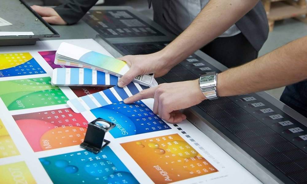
Color Calibration and Proofing
Calibrate your monitor regularly to ensure that the colors you see on-screen are as accurate as possible. Additionally, request or create color proofs from your print service provider to preview how the colors will look on paper.
Preparing for Various Print Outputs
Different print materials require specific considerations for optimal results. Whether you’re designing business cards, brochures, or large format banners, tailoring your design to the intended output is crucial.
Business Cards and Stationery
For small items like business cards, pay attention to font size, readability, and space. Ensure that important information is clearly visible and won’t be lost due to the small size.
Brochures and Flyers
Design brochures and flyers with a clear hierarchy of information. Utilize columns and sections to present information logically, and incorporate visuals to break up text and maintain interest.
Large Format Banners and Posters
Large format designs require high-resolution images and bold typography. Keep the message concise and use eye-catching visuals that can be easily seen from a distance.
Stay tuned for the next segment, where we’ll delve into proofing and quality assurance, crucial steps to ensure your design translates perfectly from screen to print.
Proofing and Quality Assurance
Proofing your print design is a critical step to catch any potential issues before sending it to the printer. Proper proofing ensures that your design will translate accurately from screen to print.
Soft Proofs vs. Hard Proofs
Soft proofs are digital previews of your design that give you an idea of how it will look when printed. Hard proofs are physical printouts that provide a more accurate representation of the final result. Both types of proofing are essential to identify any discrepancies.
Collaborative Proofing Process
Involve multiple eyes in the proofing process. Different team members can catch various issues, such as typos, design inconsistencies, or color discrepancies. Collaborative proofing minimizes the chances of errors slipping through.
Finalizing Artwork for Printing
Before sending your design to the printer, ensure that it’s prepared correctly to avoid any hiccups during the printing process.
Packaging Files for Printers
Collect all fonts, images, and linked files used in your design and package them together. This ensures that the printer has everything they need for a seamless printing process.
Communication with Print Service Providers
Maintain open communication with your print service provider. Discuss file formats, color profiles, and any specific requirements they might have. Clear communication reduces the likelihood of misunderstandings.
Common Mistakes to Avoid
Avoiding common mistakes can save you time, money, and frustration in the print process.
Low-Resolution Images
Using low-resolution images leads to pixelation in print. Always use high-quality, high-resolution images for crisp results.
Ignoring Bleed and Safety Margins
Neglecting bleed and safety margins can result in unwanted cropping or white edges. Ensure your design extends into the bleed area and keeps important elements within the safety margins.
Incorrect Color Profiles
Failing to use the correct color profiles can lead to color inconsistencies. Convert your design to CMYK and proof with accurate color settings.
Staying Updated with Printing Trends
Print technology is constantly evolving, and staying informed about the latest trends can set your designs apart.
Sustainability and Eco-Friendly Printing
Incorporating eco-friendly practices in your print design, such as using recycled paper and sustainable inks, aligns with modern environmental concerns.
Innovative Print Techniques
Explore unique printing techniques like embossing, foiling, or die-cutting to add depth and tactile elements to your designs.
Conclusion
Designing for print perfection requires a blend of artistic creativity and technical knowledge. By understanding digital prepress, print design basics, file formats, typography, layout, color management, proofing, and avoiding common mistakes, you’ll be well-equipped to create impactful and flawless print materials that captivate your audience.
FAQs
Q1: What is digital prepress?
A1: Digital prepress is the process of preparing digital designs for high-quality print production.
Q2: Why is color management important in print design?
A2: Color management ensures that the colors in your design look the same when printed as they do on-screen.
Q3: What are bleed and safety margins?
A3: Bleed is the area outside the trim where your design extends, while safety margins ensure important elements aren’t trimmed off.